project: personal branding
Role: Lead Designer
Over the years, I’ve struggled to find a name that truly represents my work and the way I want it to be showcased. For the longest time, I stuck with “Magen Q Designs” or something along those lines. But after a lot of self-reflection, I realized it really just doesn’t roll off the tongue, does it? I wanted something different—something a little funky, a little weird, and a little more authentic. If you know me, you’ve probably noticed how often I’m traveling back and forth between Texas and California. In Texas, I find myself missing California. And when I’m in California, I’m always longing for Texas.
And just like that, the perfect name clicked: The Lone Coast Collective. It’s a blend of the West Coast Vibes and the Lone Star State Spirit—a reflection of my life and my journey.
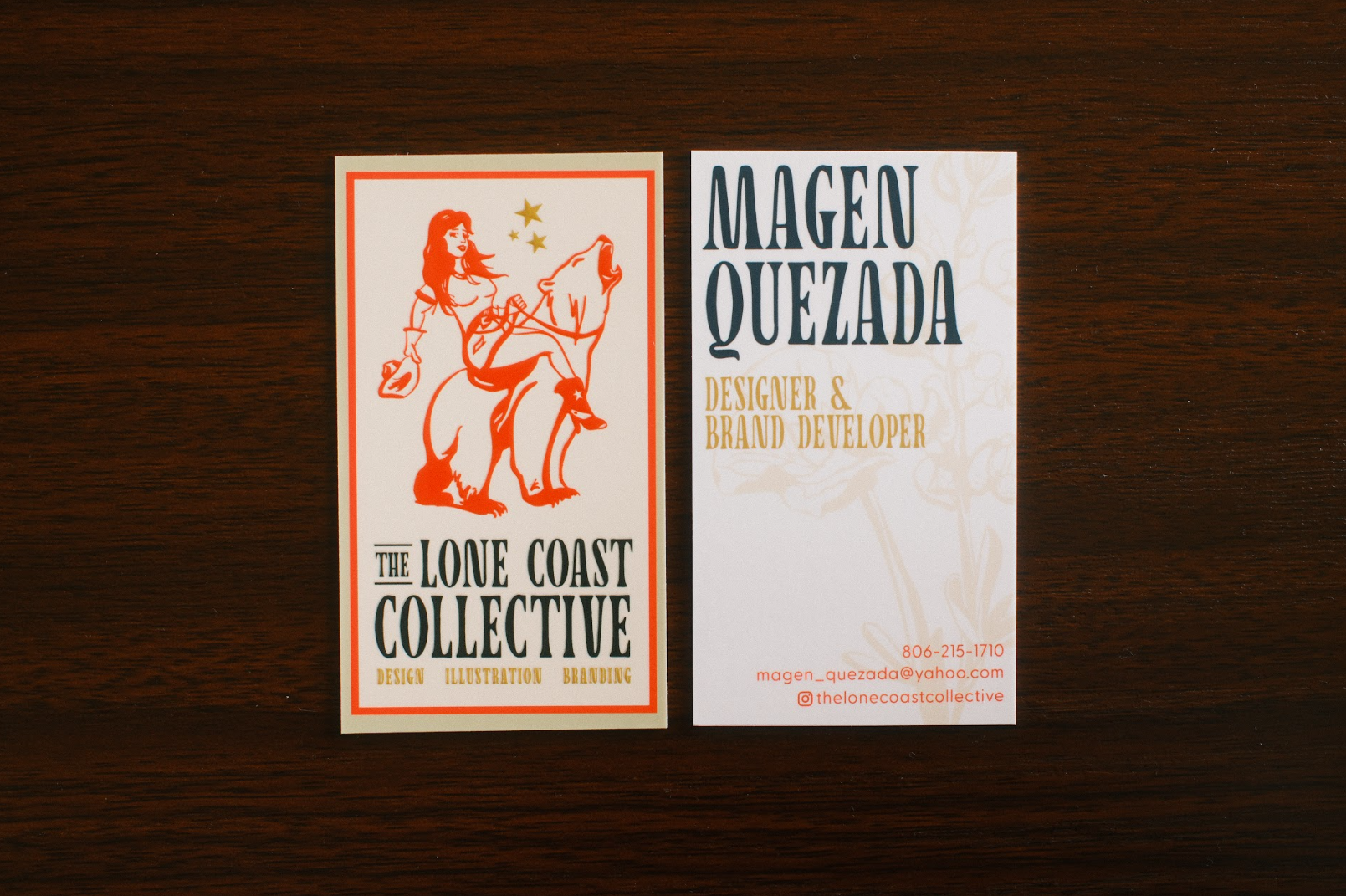
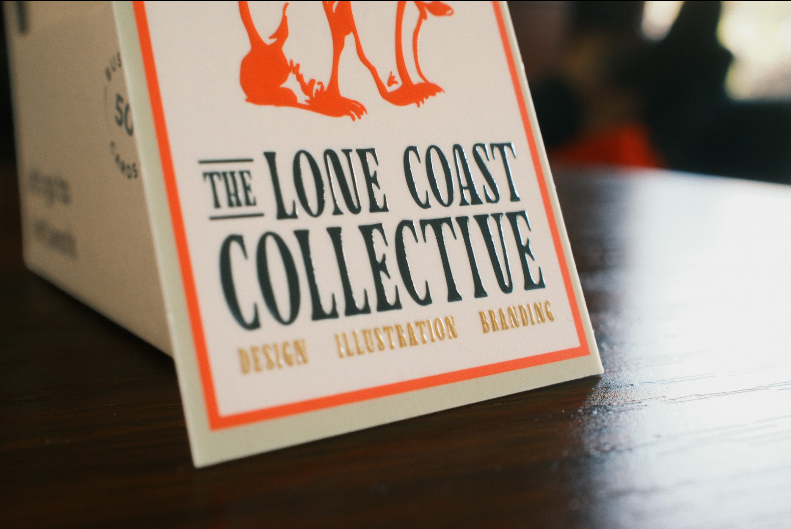
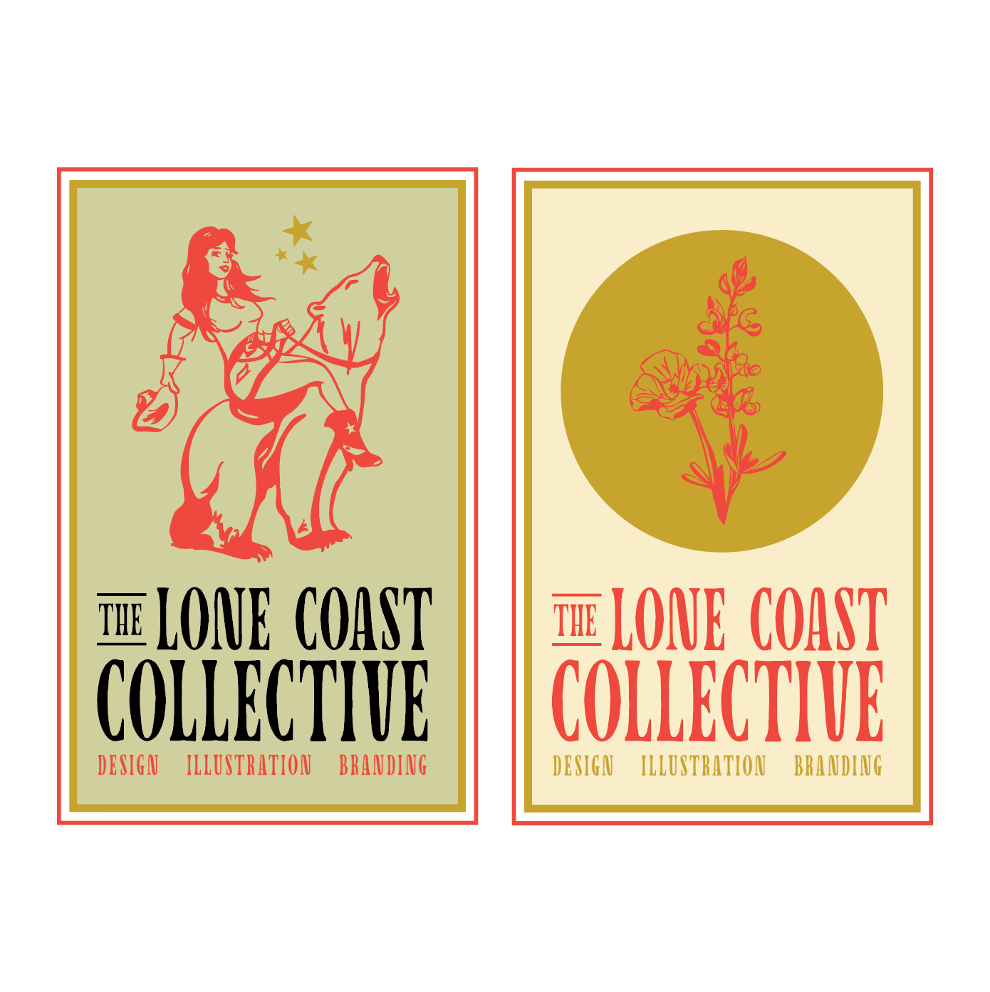
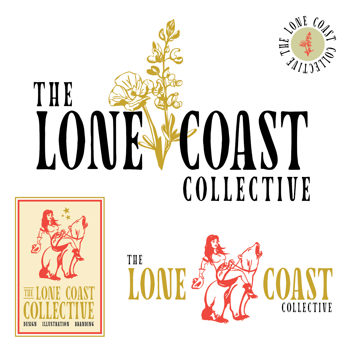
Creating the brand identity for The Lone Coast Collective was no small task. It took countless hours of brainstorming to visually merge two things that, at first glance, don’t seem to go together. The first idea was simple: combine the state flowers - the Texas Bluebonnet and the California Poppy. From there, I paired it with a typeface that feels both western and a little offbeat—just the right amount of “weird.”
Next up was the centerpiece: a custom illustration. Picture this - a cowgirl riding the bear from California’s state flag. Don’t ask me how I managed to draw it (lots of erasing and redoing, trust me), but somehow, it came together.